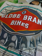
 Bottle cap, billboard, big fonts, and red – Globe is making a statement with the brand: “inspire everyone to a cycling lifestyle.” Also, a particular attention to detail, serious about the product, and bringing something to market they believe in. This isn’t some diluted idea and they did it in less than a year.
Uploaded by Hugger Industries | more from the Bike Hugger Photostream.
…We're riding townies, adventure, and mountain bikes. Find recommendations on our store page. As Amazon Associates we earn from qualifying purchases.