 When I took over buyer duties at the shop, I was quick to embrace using the online ordering option from QBP, one of North America’s biggest cycling product distributors. What made it for me was speed with which I could create an order, save it, and then add on to it before actually submit. That website plus QBP’s broad product selection without a doubt were responsible for QBP becoming my shop’s number one parts vendor despite having 2 local competing distributors in the greater Seattle area.
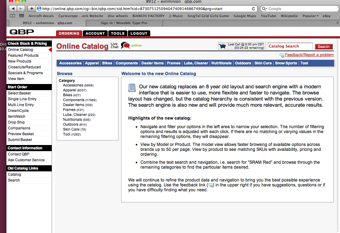
Very recently, QBP heavily revised their website “with a modern interface that is easier to use, more flexible and faster to navigate.”
This move fills me with the burning rage of a billion f###ing suns. More steps to find information, more scanning up-down to find information, robust yet rarely used features in the beginning of menus, etc. Whereas before I could run from the mechanic’s station and quickly add an item to an order, now I sift through features that I’ll never use. Essentially, the website might be friendlier to a novice who might want to explore, but it’s infuriating to someone who is experienced. And some things seem ridiculous: the default organization for tubes after selecting a brand is by price, not ISO size, not width, and not stem length except by coincidence. So a tube size 18” might follow a 700C size, in turn to be followed by a 650B.
This reminds me of how Velonews.com and Cyclingnews.com both chose nearly unreadable web layouts in the past year or so. With “online magazines”, I figure part of the reorganization is to offer advertisers better exposure, so I I can forgive them (just) a little. But with QBP, I AM the money. I guaranty that they will receive less of my shop’s business. And I don’t even need to do this as spite, because they just made it harder for me to buy stuff from them.
…We're riding townies, adventure, and mountain bikes. Find recommendations on our store page. As Amazon Associates we earn from qualifying purchases.